
The pencil-drawn cover actually kinda looks better in person. Doesn't make it any less of a lazy effort though.

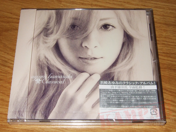
The back cover which has pencil marks and shit
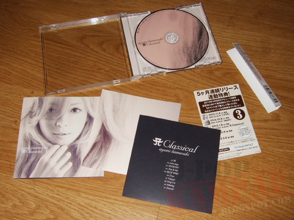
The CD design which also has pencil marks and shit. At least her team got creative this time round and actually included a first press poster!!! But oh wait...
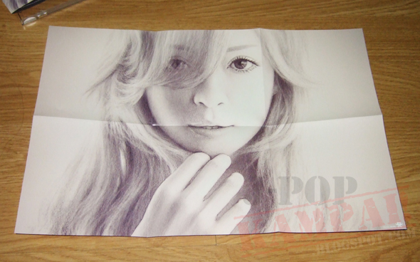
Same old shit.


No comments:
Post a Comment