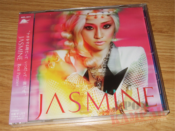
Just got my copy of JASMINE's latest single today ohohohoho.
Don't know if you guys have seen the original cover before but I preferred that, although it's only a different colouring + without the text. I'm still fine with this though so it's all good. Plus it's probably one of JASMINE's best single covers because... you know, it's actually a medium close up for once.

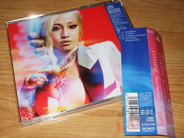
Back cover + OBI


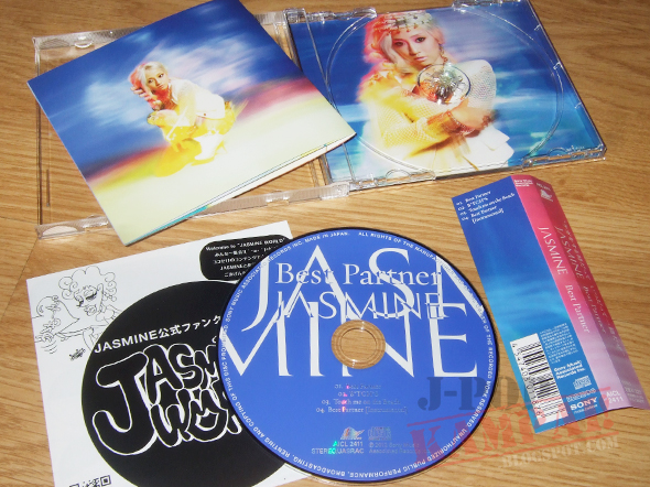
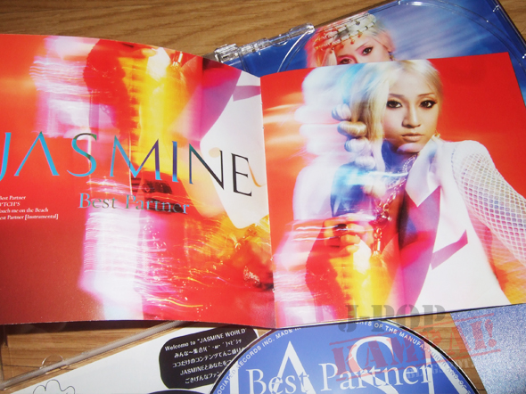
Overall pretty much the typical JASMINE packaging after her first album GOLD. If only they stuck with the first press digipak :(
I also realised that this is probably the first JASMINE release to not feature her first logo, which is that lame badge thing with her name in cursive text inside. Apparently the JASMINE thing with the special A is now the new one or something. New single cover pose, new logo and shit, did they sack her creative team or something? Cuz that's good news for everyone!


No comments:
Post a Comment